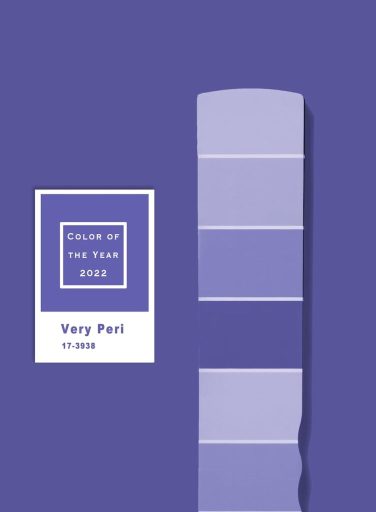
For the first time in the 22-year history of Pantone’s Color of the Year, the Pantone Institute has created a brand new color for the franchise made just for 2022. PANTONE® 17-3938 Very Peri is a dynamic periwinkle blue with a vibrant, violet-red undertone designed to evoke the glowing touchscreens of the digital world and the creative possibilities of the future.
The company created a color instead of delving into their pre-existing archive, a decision that was a vital element of this year’s selection process. Very Peri, a warm shade of periwinkle blue with a violet-red undertone is a manufactured brand-new color to suit a world in transition.
According to the institute, creating a new color for 2022 was itself symbolic of the changes taking place in the world right now, following an intense period of isolation and uncertainty. Like last year’s selection of two colors, Ultimate Gray and the sunny yellow Illuminating, the choice of Very Peri was largely influenced by the desire to overcome the COVID-19 pandemic, environmental concerns and a larger reckoning with injustice and flaws within our current social structures.

Pantone Color Institute specialists said they also took into account the promise of eye-opening perspectives and possibilities, our increased reliance on digital technology and “this whole thing with the metaverse” in developing the new hue. That’s a great deal of responsibility to ask of any color, but in the name of creativity, newness and the future, they created one.
The global authority describes the color as “courageous,” “empowering,” “spritely,” “joyous,” “dynamic novel presence,” “imaginative,” “whimsical aesthetic,” and “futuristic,” making it a shade that offers up hope as we enter another year of uncertainty.
As with previous years, the Color of the Year is based on more than just design trends. “It expresses the mood of consumers and captures the collective mood of the world,” explained Laurie Pressman, Vice President of the Pantone Color Institute, over Zoom. “But it is also about psychology: the emotion that is tied into it. How do we capture what we are going through right now? It’s a complex color, a dynamic color. That’s what makes the color so interesting. It is an empowering mix.”
“It was really important for us to come up with a new color, because we have a very new vision of the world now,” said Pantone Color Institute’s Executive Director Leatrice Eiseman in a video call. “It is literally the happiest and the warmest of all the blue hues,” she added, describing the shade. “Because of that red undertone, it introduces an empowering feeling of newness, and newness is what we’re looking for.”
The blue family was a starting point, due to the familiarity, comfort level, safety factor and beloved sense many people have for blue. They also wanted to relay a sense of freshness, movement toward the future and a reflection of the digitalized world — which is where the red violet undertone was introduced.
At its core, Very Peri truly is a combination of the digital world that everyone has grown accustomed to and the physical world, or what is seen in nature. The Pantone Color Institute has identified periwinkle blue as a color that is present in digital design and gaming, while also existing in the outside world in the form of flowers and bluebirds, among other things. This represents the merging of the two worlds in our current lives, a balance which will continue in the foreseeable future.
While Very Peri is well suited for all kinds of physical applications, Pantone couldn’t ignore where things are headed, and this is an acknowledgment of the color gamut that is available to people in that realm, (Pantone joined forces with Microsoft to offer the Color of the Year in custom Teams backgrounds, Windows wallpapers, a new Edge theme and across other Microsoft products.)
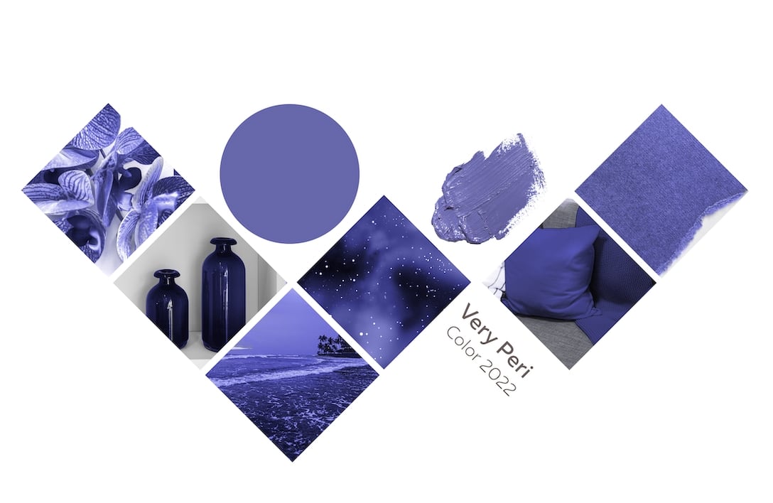
If you’re wondering how this hue translates into the home, Pantone says that it’s all about being that much-needed pop of color. Very Peri can bring in brightness while meshing with an array of materials, textures, and finishes, according to the press release. A great way to start infusing Very Peri into your space is through accessories that can easily be swapped in and out, or for those feeling bolder, you can go right to painting an accent wall or ceiling that creates depth.
Ultimately, this new shade—and even the act of creating it—is meant to represent what many are hoping for in 2022: a fresh start for a world that knows that old systems and habits can no longer stand up to the challenges of today, let alone the days to come. Veri Peri is a reminder to dream.


