Wallpaper, wood grains, and high gloss finishes are among their favorite features
By Sherry Moeller
Think moody hues, mixing old and new, and saturated colors, as well as lifestyle-driven designs. “While it would be great for a home to look as clean and tidy as possible, we have clients requesting spaces that accommodate their day-to-day needs — in a beautiful way, of course,” says Sara Swabb of Storie Collective. Swabb, along with Annie Elliott of Annie Elliott Design and Sydney Markus of Anthony Wilder Design/Build, share what they are seeing, and loving, among this year’s design trends.
Sara Swabb, founder and creative director, Storie Collective, www.storiecollective.com
1. Lifestyle and Personality Driven Design: Our clients tend to be busy professionals with young kids or playful animals. In a recent project, we created an eat-in kitchen plus mudroom addition for a busy family of five plus a furry friend. The locker style cabinetry is just stunning, but highly functional and supports this family as they rush out of the home each morning.
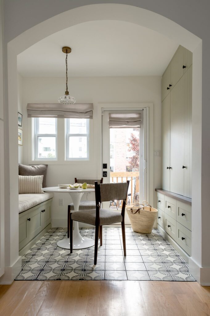
Design by Sara Swabb, Storie Collective. Cabinetry by Unique Kitchens & Baths, www.uniquekitchensandbaths.com. Photo by Laurel Estelle Photography.
2. Wood Grain in Cabinetry: We love this “trend” and we see it becoming more and more popular in 2023. The difference this year is that we are seeing cabinetry fabricated from actual wood, not particle board and veneer. Using actual wood is a little bit more of an investment, but worth the cost in terms of form and function. Natural wood grain can be a statement without looking like something straight from the 70s.
Design by Sara Swabb, Storie Collective. Cabinetry by Unique Kitchens & Baths. Photo by Stacy Zarin Goldberg.
3. Mix of Old and New: With supply chain issues of 2021 and 2022, we are seeing the comfort levels for vintage and antique on the rise. We absolutely love this trend and have mixed old with new in every project we touch. The easiest way to incorporate “old” is through antique rugs of any kind; the quality and durability outlast new rugs on the market and they have so much depth and texture. Vases, planters, pots, trays, side tables, and lighting are also easy ways to incorporate vintage.

Design by Sara Swabb, Storie Collective. Photo by Stacy Zarin Goldberg.
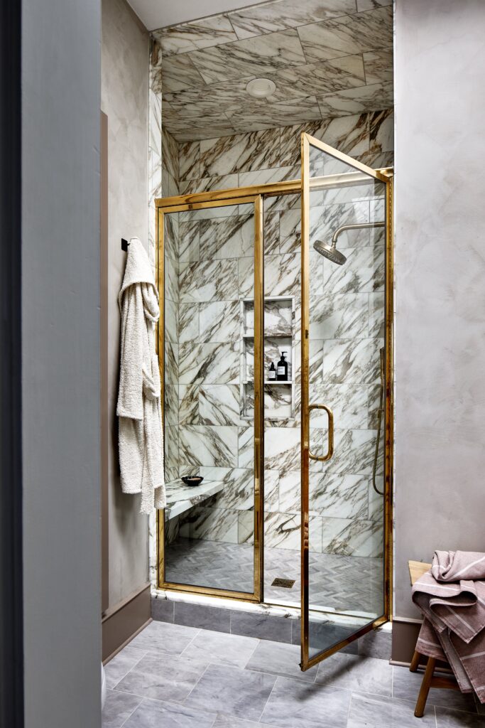
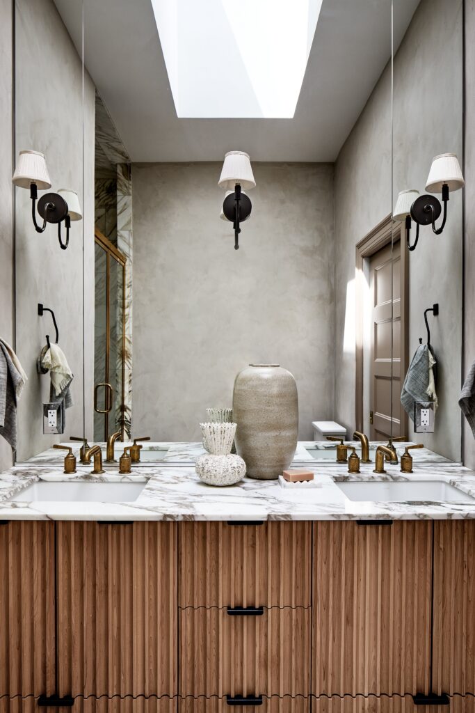
4. Limewash and Plasters: Old world materials like plaster and limewashes are now available on the retail market and social media has made them more popular than ever. We love plaster and limewash and use them paired with natural materials like striking marbles and fluted woods. To start small, we see these used in bathrooms and bedrooms, your private spaces.
5. Architecture-Inspired Interiors: Our clients have recently come to us to incorporate architectural details in their homes that have been gut renovated, and we see this trend continuing! In a classical Victorian home on Capitol Hill, we elevated the home’s architectural details to include a new stair rail, back to what could have been original millwork while creating a feminine, sophisticated space for the family and pet.
6. Saturated Colors: After years of minimalism, clients are becoming more and more ready to use color. Deep and saturated tones, not necessarily vibrant, are coming through in 2023. We are ready for it!
Design by Sara Swabb, Storie Collective. Photo by Stacy Zarin Goldberg.
Annie Elliott, Principal designer, Annie Elliott Design www.annieelliottdesign.com
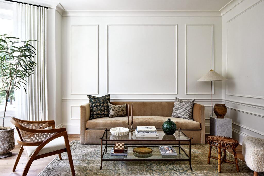
1. The Demise of Gray – Finally!
I predict that light gray finally is on its way out. We’re into warmth these days, and gray just doesn’t have it. If a neutral space is what you’re after, warm whites, ivories, and camels will be your go-to tones.
Design by Annie Elliott, Annie Elliott Design. Photo by Jenn Verrier.
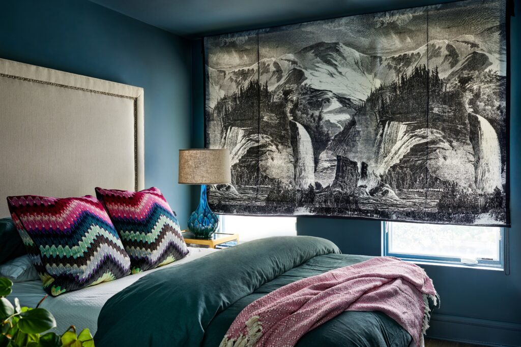
2. Moody Hues
I’m so excited for this trend: dark, moody rooms, including richly colored ceilings and woodwork. Dark Academia may be an influence here: think richly stained wooden bookcases; lush navy, green, and aubergine walls; and traditional patterns such as plaid.
Design by Annie Elliott, Annie Elliott Design. Photo by Stacy Zarin Goldberg.
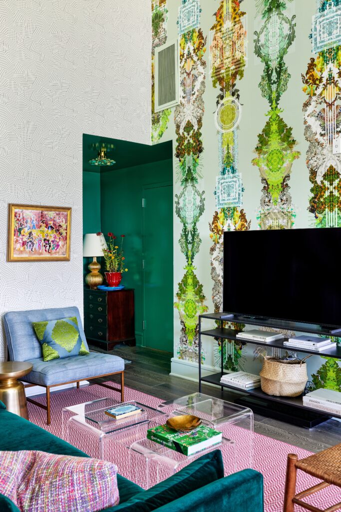
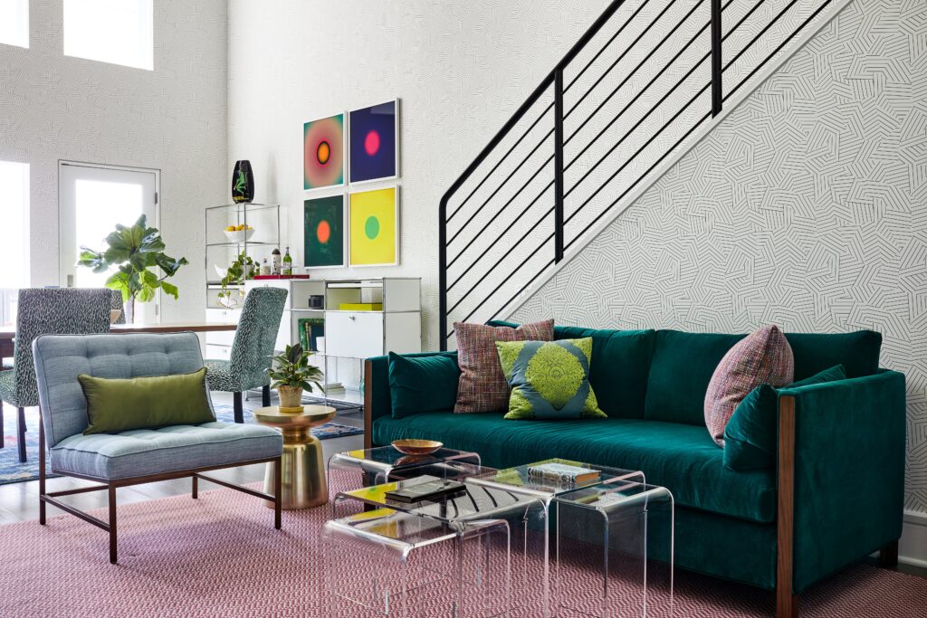
3. Wallpaper
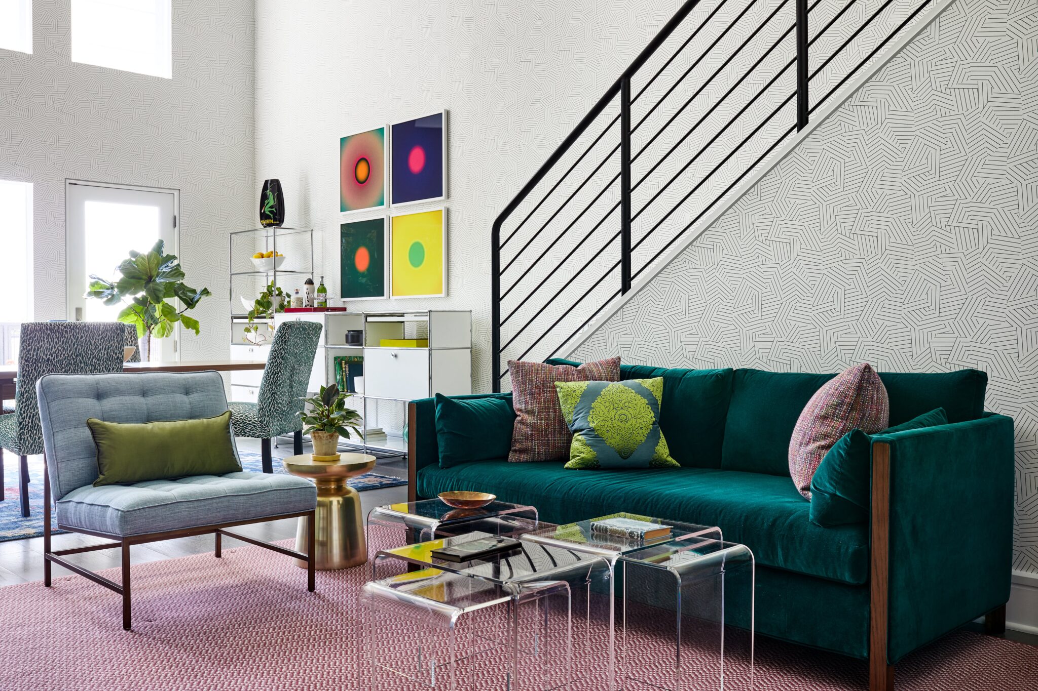
We’re beginning to see wallpaper used in public rooms – it’s not just for powder rooms and bedrooms anymore. Living rooms are the final frontier when it comes to wallpaper because people are concerned it will dominate the space. Not necessarily! We recently finished a double-height living area in a graphic black and white wallpaper, and it’s perfect. It provides just enough interest that the walls don’t feel empty…and there’s a lot of wall. Now we have to make sure that we don’t rely on wallpaper accent walls too heavily…just do the whole room.
Design by Annie Elliott, Annie Elliott Design. Photo by Stacy Zarin Goldberg.
Sydney Markus, designer, Anthony Wilder Design/Build, www.anthonywilder.com
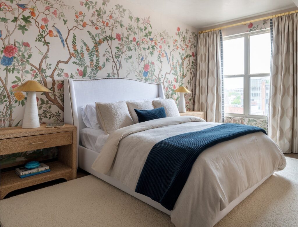
1. Nature-inspired wallpaper: We have recently been getting requests for nature-inspired wallpaper in powder rooms, including patterns with vines, leaves, flowers, and in particular birds. Nature-inspired wallpaper, which also works well in bedrooms and offices, is soothing and makes a space feel like an oasis. We’re seeing nature-themed murals, too, that give a Zen-like feel to a room.
Design by Sydney Markus, Anthony Wilder Design/Build. Photo by John Cole.
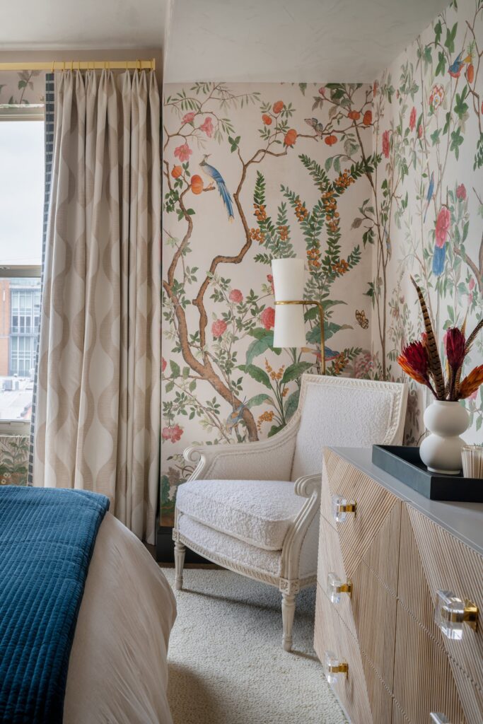
2. Boucle fabric, particularly in whites: Use boucle on accent pieces, such as throw pillows, and on upholstered chairs; the fabric doesn’t wear well, so use it in low-traffic spaces. The soft, fun fabric adds diversity and dimension to the textures in a space.
Design by Sydney Markus, Anthony Wilder Design/Build. Photo by John Cole.
3. Multi-use coffee tables: Large, airy coffee tables that are multi-purpose and highly functional are in demand. Some are two-tiered with space for ottomans underneath, as well as trays, all of which are customizable.
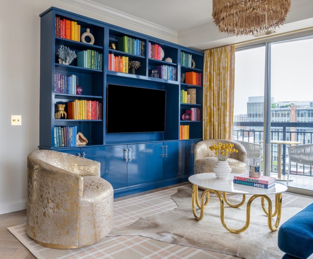
4. High gloss finishes: This can be on cabinets, bookshelves, bars, ceilings, and walls. We are currently designing a library with high-gloss paint on all the built-ins. High gloss finishes, such as on a dining room bar or a library bookshelf, dress up a space, and add warmth and a moody vibe. Jewel-toned hardware adds more dimension.
Design by Sydney Markus, Anthony Wilder Design/Build. Photo by John Cole.
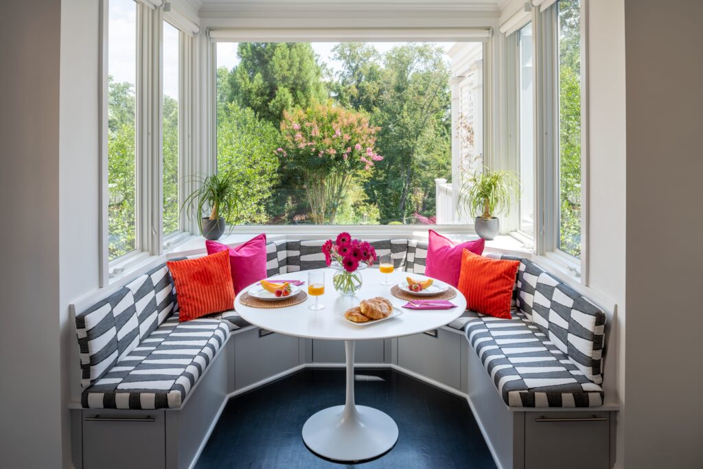
5. Breakfast nooks and banquettes: While some breakfast nooks accommodate banquettes easily, we can custom design them in most spaces. Coordinating fabrics and finishes in the banquettes, as well as making the items in the nook accessible and functional are the main considerations.
Design by Sydney Markus, Anthony Wilder Design/Build. Photo by John Cole.


